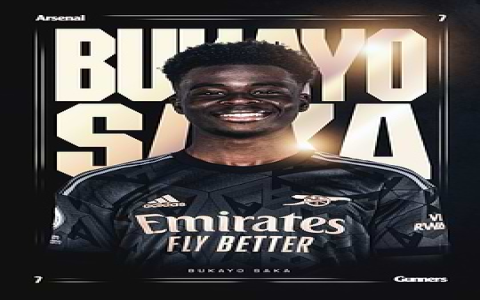
So today I felt like making a proper Arsenal poster for my room, you know? Because just buying one feels a bit lazy, and honestly, who has the cash for fancy prints right now? Plus, doing it myself is way more fun.
First things first, I needed something to actually work on. Fired up my laptop and grabbed that free design software everyone talks about. Gimp, Photoshop alternatives, you get the idea. Opened a new file. Kept it simple – chose the regular paper size everyone uses for prints, A4 or Letter. Figured that was easiest.
Now for the base. Arsenal is red and white, obviously. I didn’t want anything too plain, so I tried adding a background. Found a decent, slightly textured red image online. Slapped it onto my design. But it was just too red, right in your face! So, I messed with the opacity to let some white from the background layer peek through underneath. Made it look like a washed-out, faded red shirt kind of thing. Perfect.
Time for the cannon! You can’t have an Arsenal poster without the cannon logo. Found a clean PNG version online – the one with just the cannon, no text. Easy! Pasted that bad boy right in the middle. It looked okay, but a bit flat against the background. Needed to make it pop. Played around with a faint white outline effect. Bam! Instantly better, stood out just right.
Got a bit stuck here. The space above and below the cannon looked empty. Needed some text. “ARSENAL FOOTBALL CLUB” felt essential. Grabbed the text tool. Picked a clean, strong font – nothing fancy, something straightforward and bold. Wrote “ARSENAL” right above the cannon. For “FOOTBALL CLUB”, I put that underneath. Used a slightly smaller font size to keep things balanced. Centered it all, obviously. Used pure white. Looked clean.
Wanted a bit more character, something special. Remembered that legendary “INVINCIBLES” season. That still gives me goosebumps. Found a picture of the Premier League trophy icon. Got that onto my poster too. Placed it in the top left corner. Resized it carefully so it wasn’t huge but you could see what it was. Then, right underneath the trophy, wrote “INVINCIBLES 2003-04” in a classic-looking font. Added that little star detail Arsenal uses above the badge sometimes – just a little white star near the trophy. Little touches, you know?
Felt like it was almost there, but needed some focus. Almost forgot! What about the players? Scrolled through my pictures. Found a good one of Bukayo Saka celebrating – pure energy! Cut him out carefully using the selection tools (took a few tries!). Placed him slightly off-center to the right. He deserved that spot. Balanced it out on the left by digging up an older pic of Thierry Henry doing his iconic celebration. Managed to cut him out too. Positioned them both so they weren’t covering the cannon or the main text. Made the background slightly blurry where Henry is to push focus forward. Adjusted their brightness a bit so they fit the overall colour feel.
Last checks. Moved all the bits around a tiny bit more – nudged the text, adjusted Saka’s and Henry’s positions slightly. Added the sponsor’s name (“Fly Emirates”) in small letters at the bottom corner – gotta have it, but keep it subtle. Finally, wrote “COYG” (Come On You Gunners!) right at the bottom, centered in bold white. Felt complete!
Time to make it real. Saved the final file, obviously! Now, the printing part. I knew my cheap home printer wouldn’t cut it for a poster this big. So I exported the file and took the file to the local copy shop. Paid a couple of bucks for a decent print. Got it on nice, thick card.
Result? Hung it up on my wall. Looks proper smart! Not bad for an afternoon’s work. You really don’t need fancy gear to make something decent. Just start simple and build it up!


