
Getting Started with Premier League Fonts
So I was making custom Premier League jerseys for my Sunday league team last month. Needed proper lettering like the pros wear. Started searching online and boom—tons of font options popped up. Official-looking ones, fan creations, free downloads. Got confusing real fast.
The Hunt for Real vs Fake Fonts
First I grabbed two samples: the official Premier League font PDF from their style guide (paid $20 for it!), and a free fan-made version from some football forum. Pulled both into Photoshop and slapped them on jersey mockups.
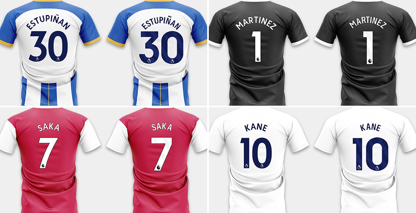
Official fonts had:
- Crisper corners on letters like M and W
- Perfectly even spacing between characters
- Thicker stroke weight on curved letters like S
Fan-made versions showed:
- Slightly wobbly outlines when zoomed in
- Weird gaps between E and R combos
- Number 8s looking skinny in the middle
Testing with Actual Printing
Took both files to my local print shop. The legit font printed smooth as butter with clear edges. But the fan font? Ink bled a tiny bit on curved letters. Shop guy said cheap fonts often lack proper vector points. Made our team name look fuzzy on the fabric. Total disappointment.
Price Shock Moment
Nearly choked when the official style guide quoted $500 for commercial use! For my amateur team? No way. Dug through design subreddits and found a workaround: bought a legit-inspired font pack for $15 from a former Adidas freelancer. Not 100% authentic but way closer than freebies.
Final Verdict from My Experience
If you’re printing jerseys or selling merch, save time and pay for licensed fonts. The headache ain’t worth it. But for personal stuff like posters or FIFA stream graphics? Decent fan-made fonts work if you triple-check spacing issues. Pro tip: Always print test swatches first—screen previews lie!
Ended up mixing both for our kits: paid font for player names, tweaked fan font for numbers. Looks proper sharp under stadium lights.