I was sitting in my room last week, staring at the boring walls, and decided it was time to give it a major upgrade with some Manchester United love. The new season just kicked off, and I needed those posters to pump up the vibe. You know how it is, I thought, why not pick the best ones for this season and make my space feel like a mini Old Trafford? So, I jumped right into it.
The Search Begins
First off, I fired up my laptop and started hunting online for United posters. It took a while, man, because there are like a zillion options out there. I ended up clicking through tons of designs, mostly focusing on what’s fresh and cool this season. Some were old-school with legends like Cantona or Rooney, but I wanted current stuff, you know? Like, they just announced their squad changes, so I made sure to look for players who are hot now – Garnacho, Fernandes, those guys. Kept it simple, though, skipped anything too complex because, honestly, my brain was frying.
Then, I sorted through the mess. Saw one with a retro feel but felt too dated. Another had a modern twist with bold red colors that popped, and I bookmarked it fast. But I remembered reading in a blog somewhere that fans often mess up by picking designs that fade quickly. Didn’t want that drama. So, I made a list in my head: needs to be durable, look good from afar, and fit the room’s vibe. All this without spending a fortune, cause budgets tight these days.
Picking My Top Faves
Next, I compared the top contenders I’d found. Here’s what stood out:
-
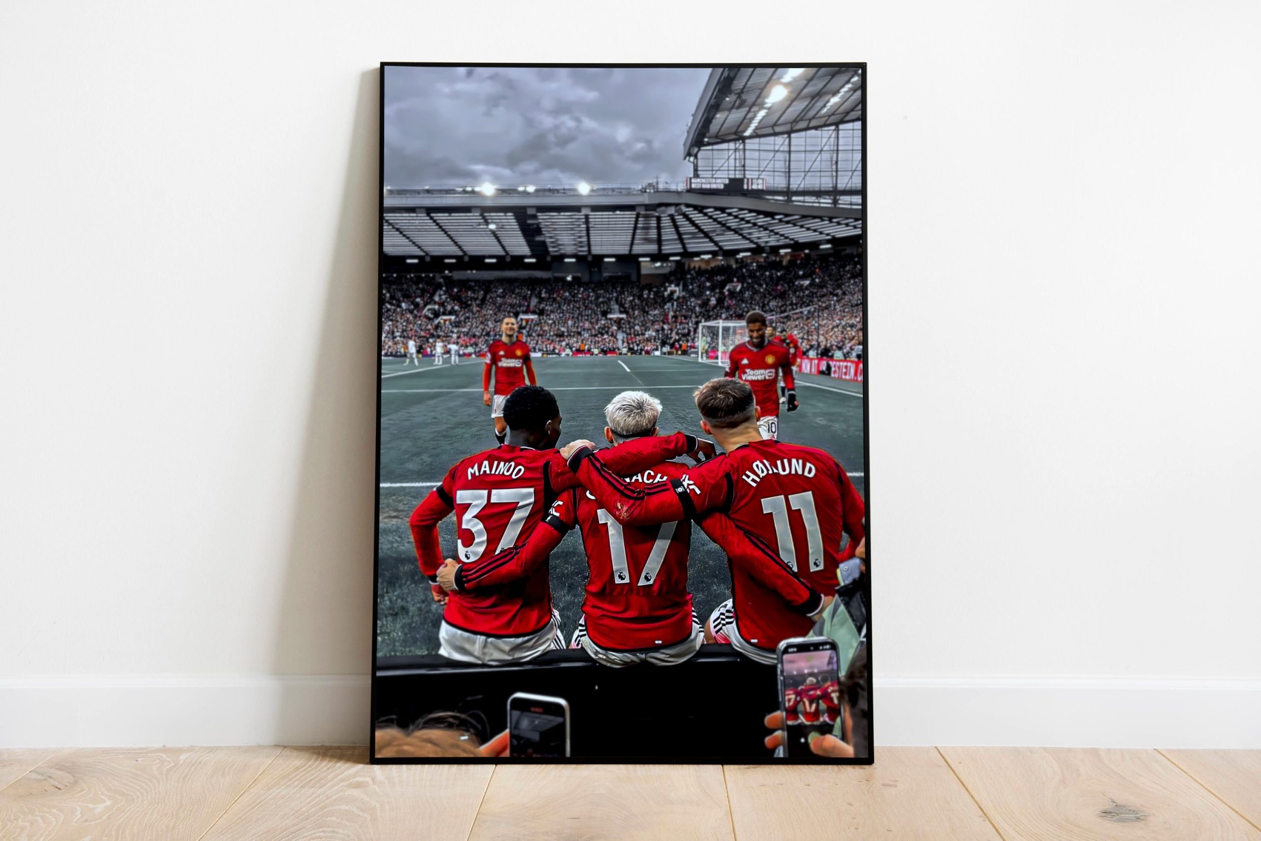
Option one: A killer shot of Garnacho celebrating a goal from last month’s match. The energy was insane, totally captured how pumped he gets, plus it had that new-season spark.
Option two: A team poster with all the stars in action. I liked it cause it shows the squad’s depth this year, but it felt a bit crowded for my small wall.
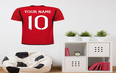
Option three: A minimalist design, just the United logo with flames around it – saw something similar in a fan group. Super clean and easy on the eyes, perfect for not overwhelming the room.
After fiddling around, I settled on the minimalist one. Why? Because it’s timeless yet season-ready. No distractions, just pure United spirit that screams 2025-26 campaign. Plus, I figured it wouldn’t get old fast, unlike some player-focused ones that feel outdated if the team underperforms.
Getting It Up On the Wall
Finally, it was time to make it happen. I ordered it online, waited a couple days for delivery, and unpacked it carefully. The print quality? Solid, no smudges or weird colors, just crisp and bright. Grabbed a hammer and nails from the garage, measured a spot above my desk, and bam, hung it right there. Whole thing took like 10 minutes, tops. Now, every morning I walk in, it catches my eye – feels like I’m part of the stadium roar, even from home. Totally worth the effort for that daily boost.
Wrapping up, this whole adventure taught me that keeping it simple pays off. Yeah, I could’ve gone fancier, but this pick fits perfect and brings that fresh-season energy every day. If you’re thinking of doing something similar, just dive in, trust your gut, and make your room rock.