So today I got this itch to really understand that Aston Villa vs Liverpool game everyone’s been yapping about. Honestly, the usual match reports just skim the surface, right? I wanted to see what the deeper numbers said. Started simple: just pulled up the final score app notification on my phone while gulping down coffee. 1-0 to the Reds. Okay, cool, but… how?
The Grind Begins
First stop was the Premier League website. Typical, right? Hoping for some ready-made stats I could chew on. Found the basics – possession, shots, corners. Villa had more corners? Interesting. But it felt thin. Just numbers floating in space without meaning. Needed context. Needed to see where things happened.
Then I remembered those fancy passing maps and positional plots some smart folks use. Honestly? No clue how to generate those myself. Tried searching “Aston Villa Liverpool detailed stats.” Got flooded with sites demanding sign-ups or pushing subscriptions. Clicked through a few anyway. Mostly heatmaps looking like abstract art. Useless.
Getting My Hands Dirty
Got stubborn. Pulled out the laptop. Found a decent stats aggregator – still wouldn’t call it user-friendly. Took forever. Scrolled through endless tables: duels won, tackles, interceptions… mind-numbing. But I was hunting something specific: Liverpool’s press. Felt like they squeezed Villa high up. Needed proof.
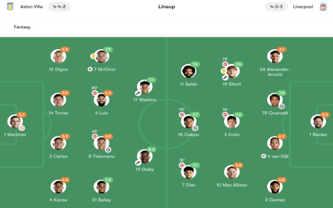
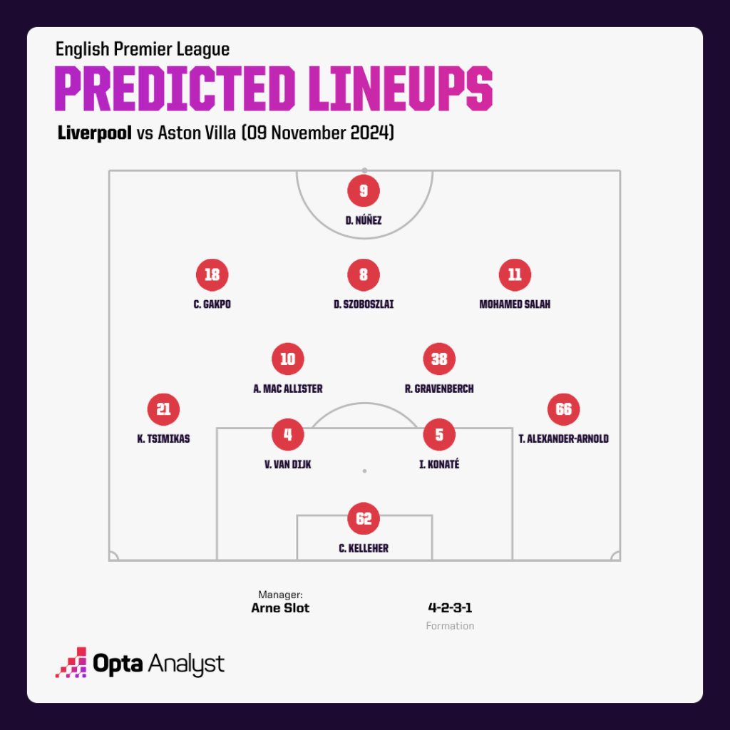
Started jotting down key positions based on player ratings I found:
- Where did Konaté mostly operate? (Deep, man, like a wall).
- How high up was Szoboszlai? (Right up in their grill first half!).
- Did Bailey for Villa even get a touch near our box? (Barely – Trent shut him down constantly).
Cross-referenced this with average positions diagrams when I finally found them. Ding ding ding! There it was. Liverpool’s shape – super narrow front three, midfield pressing together. Villa’s midfielders? Totally isolated. It clicked! That’s why Villa’s passing lanes looked so clogged. Felt like cracking a code. Well, kinda.
The “Ah-Ha!” Stuff
Dove deeper now I understood the positions:
- Díaz’s work rate numbers: More sprints than anyone? Seriously? That explains why their right-back looked so ragged.
- Liverpool tackles in the middle third: Sky high! Exactly where Villa tried (and failed) to build through Mac Allister & Endo swarming.
- Villa long balls: Way more than usual. Hah! Forced by the pressure we just saw. They couldn’t play through us!
Started overlaying these stats mentally onto the positions I saw. Suddenly, individual moments made sense. That wild McGinn pass that went nowhere? He had no options! Positional overload by Liverpool. Darwin running channels like a madman? Pulling their center-backs apart creating space. The stats weren’t just numbers anymore; they told the story why it ended 1-0.
Putting It Together… Roughly
Ended up filling scraps of paper with scribbles: arrows showing pressure zones, stick figures for player positions (don’t laugh!), circled key stats. Took a blurry pic – looked like detective work gone wrong. But honestly? This messy process – the dead ends, the random searches, finally finding that one diagram that made the lightbulb go off – that’s how the sausage gets made. Way more satisfying than just reading someone else’s polished analysis. Understood the “how” underneath the scoreline. Mission accomplished… kinda messily!