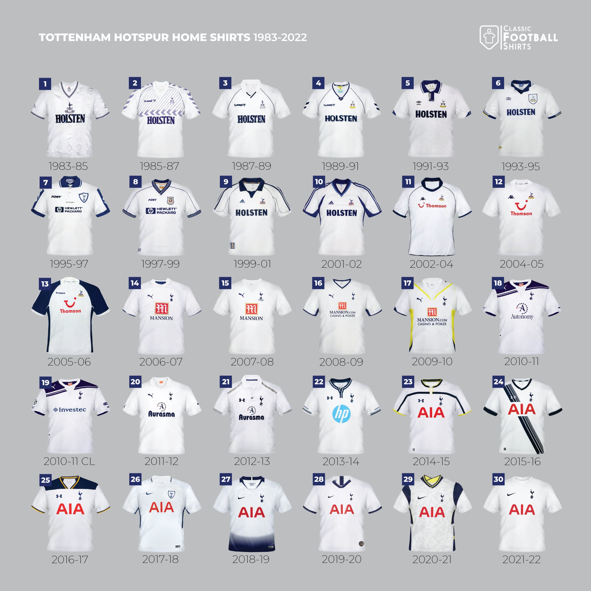
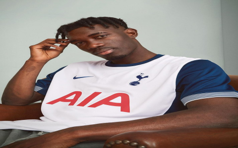
So yesterday I got this wild idea to dig through old Spurs kits and maybe sketch some redesigns. Figured it’d be fun since I’m always scribbling stuff in my notebooks anyway. Started by pulling dusty boxes outta the attic – turns out I kept stacks of football magazines from like 2003 onwards. Those thick glossy pages smell kinda weird now, but man, the old ads are pure gold.
The Research Mess
Plonked myself right in the middle of the living room floor. Got my laptop open, those magazines scattered everywhere, and my phone buzzing with kit history sites. Searched “Tottenham shirts 1980s” first. Bam! Found that crazy yellow Admiral one with the big collar. Thought “Why’d they ditch collars? They look classy!” Drew a quick version with a sleeker collar on tracing paper.

Moved onto the 90s Hummel chevrons. Always loved that mess around the shoulders. Grabbed my sketchbook and a blue pencil. Tried copying it freehand – absolute disaster. Looked like a toddler drew some crooked mountains. Thought “Forget copying, let’s play.” Ended up sketching a home shirt with skinny blue chevrons pointing up from the hem. Felt kinda fresh.
Hitting a Wall
Got cocky and opened Photoshop. Scanned my little doodles. Started coloring them in… total crap. Tried making that collar design white on a navy shirt. Spent ages fiddling with the color picker trying to find the perfect shade of blue Spurs used in ’87. Got frustrated because the digital colors felt too clean, too fake compared to the old washed-out mag photos. Closed the laptop with a sigh.
Pulled up a YouTube compilation instead – “Tottenham Kit History 1970-2020”. Seeing them move, get sweaty, get muddy… way different vibe. That iconic blue and white under stadium lights? Chef’s kiss. Realized my designs were maybe trying too hard. Modern kits gotta feel now, not just pasted from history.
The Lightbulb Moment
Went back to the magazines. Flipped slower this time. Noticed little things – like how the sponsor logos changed size and position over the years, how the badge sometimes sat high, sometimes low. Started tracing just the stupid chicken badge over and over in the margins of a newspaper. Muscle memory kicked in. Suddenly, I understood the angles better.
Gave Photoshop another shot. Focused on a simple modern template. Took just one thing from the old kits: that thick navy collar from ’82. Kept the badge small, high on the chest. Made the body solid white. Sharp, clean. Then, inspired by the chevrons but wanting less noise, added a single, subtle navy racing stripe down one side from collar to hem. Simple. Spurs. Modern. Felt right.
Printed it on regular paper to see how the colors looked real life. Tacked it to my wall next to an old poster. It fit. Didn’t scream “retro”, more like it nodded respectfully. That’s the sweet spot, I think. Maybe less is more sometimes. Gonna drink my tea and stare at it awhile longer.

